0:00
/
Generate transcript
A transcript unlocks clips, previews, and editing.

Gold Breaks $4,400 as Yen Intervention Cracks the Dollar Rally

Gold up 8%, silver 10%, and the headwinds I have described for two months just became tailwinds. Here is what I think happens from here.
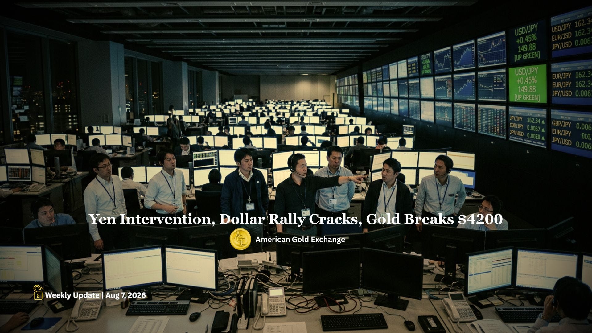
Japanese trading floor with currency screens showing yen intervention and gold breaking $4200
[Section Divider Image]

Week on week, gold is up 8%, silver 10%, platinum 6% and palladium 8%.

That happened after a stretch of global market volatility that Iran and their proxies started by widening the range of their attacks around the Persian Gulf. Stock market indices in the United States and South Korea tumbled before rebounding. U.S. Treasury values tumbled with their yields spiking higher. And then came the piece that mattered most for us: a major coordinated government intervention by the U.S. and the Japanese in the Japanese yen, which broke the dollar’s recent rally.

It is no wonder precious metals caught a bid.

In my last update I told you the weaker dollar had not buoyed gold yet. Well, precious metals headwinds are now turning into tailwinds, and this week gold finally reacted, with pretty strong conviction.

I am Dana Samuelson, president of American Gold Exchange in Austin, Texas, and what follows is how I am reading my own charts after last Friday’s close. Support and resistance levels, trading ranges, and the other markets that have been material in driving metals values higher.

[Section Divider Image]

Platinum and Palladium Broke Out First, a Day Before Gold and Silver

Here is the detail from this week that I want you to have, because what is unusual about this rally is that platinum and palladium actually led it.

Gold and silver really started to move on Wednesday. But platinum and palladium moved higher on Tuesday, a full day earlier. Platinum broke out in the futures contract over $1,680 during Tuesday’s trading. Palladium broke out over $1,310 the same day.

And who called it? Jim Wyckoff, our senior precious metals market analyst. On Tuesday, his daily gold update was headlined “Bullish upside breakouts in platinum, palladium catch gold, silver traders’ attention.” That is exactly what happened. Jim saw it coming, and gold and silver followed platinum and palladium higher on Wednesday.

And by Friday of the same week his update read: “Gold extends gains, sharply up, following surprisingly weak U.S. jobs data.” Congratulations, Jim. We are grateful to have you on our team.
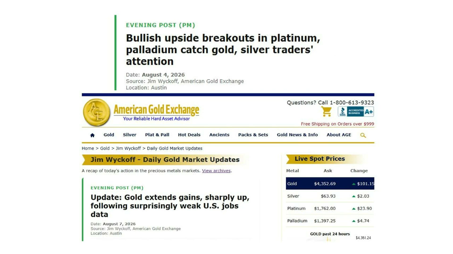
American Gold Exchange website showing live gold price at $4,352.69 per ounce
This table shows live spot prices (the current market price for immediate purchase) for four precious metals: gold, silver, platinum, and palladium. For investors, these prices signal the real-time cost of buying physical metals or related investments. Gold is the standout: at $4,352.69 per ounce, it has surged $101.15 in a single day…an unusually large single-day move. Silver at $63.93 per ounce is also up sharply, rising $2.03, suggesting broad strength across precious metals. The simultaneous gains across all four metals point to a major market event driving investors toward safe-haven assets.

That is the tell I was watching. What I want to walk you through now is the rest of it: the exact levels I am using on all four metals, why the dollar broke down when it did, what the July jobs report really said underneath the headline, and the one number in the oil market that is still working against us even as crude comes down.

Because off this rally I do think the bottoms for precious metals are now in. I will show you the chart formations that make me say so, and I will tell you exactly which levels have to hold for this to be more than one good week.

If you have not done so already, support this Substack by becoming a free or paid subscriber and let me show you what I think happens next.

[Section Divider Image]

The Yen Intervention That Broke the Dollar’s Rally

This is the catalyst that I think really spurred precious metals higher this past week.

The U.S. and Japanese governments intervened together, to the tune of about $60 or $70 billion by market estimates, propping the yen up from its cyclical low at 166.38 to between 156 and 158 yen per dollar. Remember that it now takes fewer yen to buy a dollar, which means the yen is stronger. That move carried it back into the middle of the trading range it has been in, and back to the strong side of the 160 line. That is the line the Japanese wanted to defend.

Now, most of the time interventions do not hold. They typically fail over time. But right now, so far, it is working.
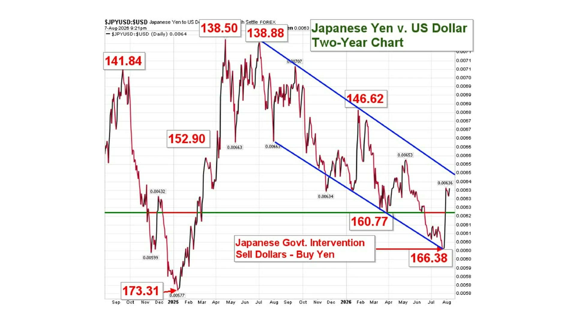
Japanese Yen versus US Dollar two-year forex chart showing intervention levels and trend lines
This chart tracks how many Japanese yen one US dollar buys over the past two years…a higher number means the yen is weaker against the dollar. For investors, a weakening yen raises import costs for Japan and affects returns on Japanese assets held by foreign investors. The yen hit its weakest point around 173 yen per dollar in early 2025, meaning the dollar was extremely strong. The Japanese government stepped in to sell dollars and buy yen (intervention), which caused a sharp reversal. Since then the yen has been recovering steadily, with the dollar now buying around 138–141 yen…a significant strengthening of the yen. This recovery matters because it signals shifting currency dynamics in one of the world's largest economies.

And what was the corresponding reaction? The dollar tumbling.

The dollar had already broken back down below 100.50 on the U.S. dollar index chart, and it finished this past week at about 99.50 on the index. So the move up over 100.50 has indeed, so far, turned out to be a fake out rather than a real breakout, as I thought it might be a month or two ago.

That is the mechanism I want you to hold on to. The dollar and gold have been moving against each other very tightly for two months. When the dollar caught a bid, gold could not make any headway. Break the dollar’s rally and you remove the thing that has been sitting on gold for those two months.
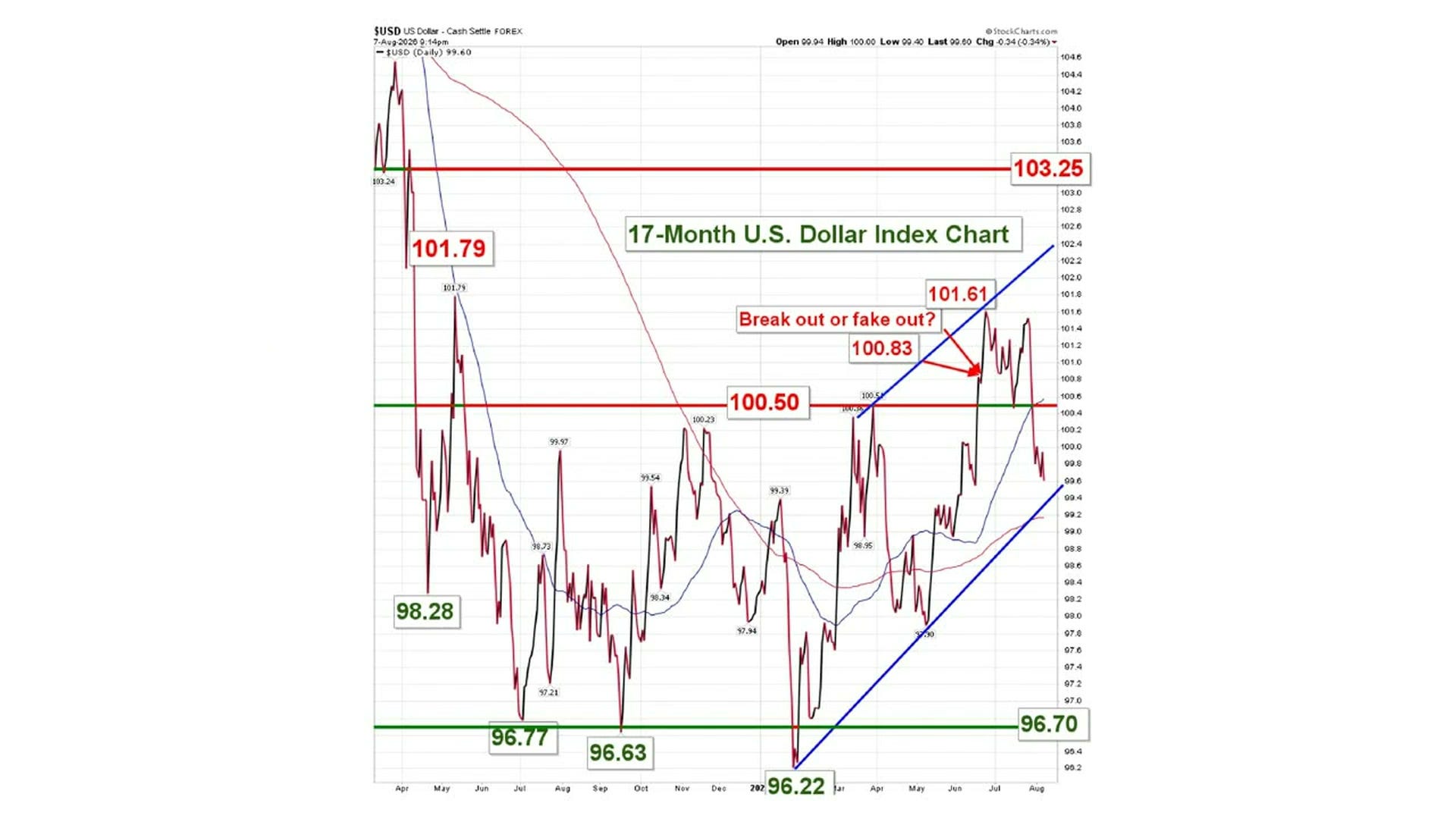
17-month US Dollar Index chart showing breakout or fakeout analysis at 100.50 resistance
This chart tracks the U.S. Dollar Index (DXY)…a measure of the dollar's strength against a basket of major currencies…over the past 17 months. A stronger dollar makes imports cheaper for Americans but can hurt U.S. exports and emerging-market borrowers who owe dollar-denominated debt. The dollar surged from a low near 96.22 up to 101.61, briefly breaking above a key resistance level (a price ceiling the index had struggled to cross) around 100.50. The chart's central question is whether that move above 100.50 was a genuine 'breakout'…a sustained move to higher prices…or a 'fake out' that quickly reversed. The index has since pulled back sharply toward 99.60, suggesting the breakout may not be holding, which could signal renewed dollar weakness ahead.
[Section Divider Image]

Gold Breaks Above $4,200 Resistance and Holds

The weaker dollar helped to buoy gold, but it took a little bit of time for gold to finally react.

Look at where we were a week earlier, on charts drawn July 31st.
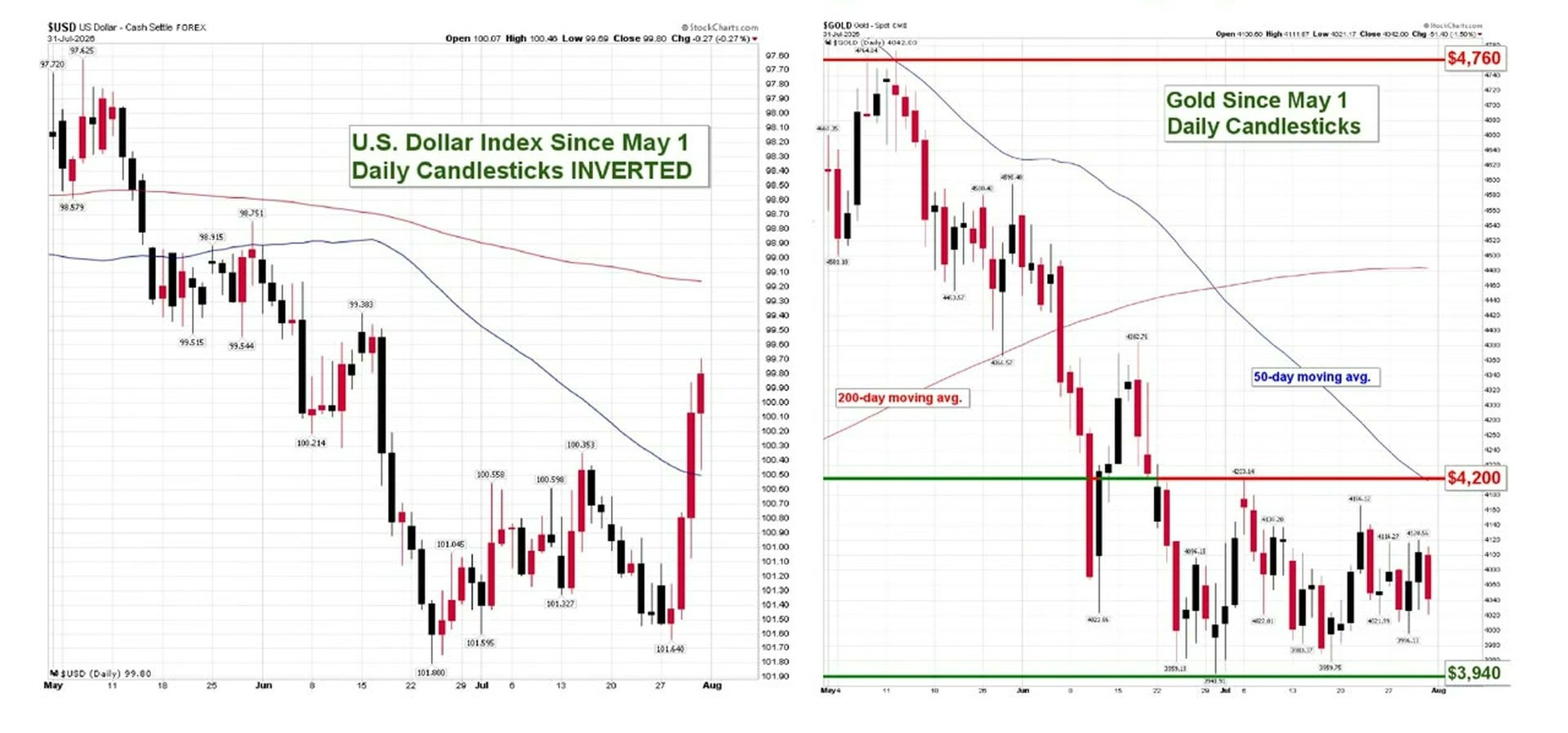
U.S. Dollar Index inverted and gold spot price daily candlestick charts May 2025
These two side-by-side candlestick charts compare the U.S. Dollar Index (left, shown flipped upside-down) with the gold price in dollars (right) from May through early August. Candlestick charts show daily price movements…each bar's body shows where prices opened and closed, while the thin lines show the day's high and low. The left chart is deliberately inverted so that a rising dollar appears as a falling line, making it easy to see how closely the two assets mirror each other. The key insight: when the dollar falls, gold tends to rise…and this period shows that relationship playing out almost in lockstep. Gold has pulled back sharply from its peak near $4,760 and is now consolidating around the $4,200 support level (a price floor where buyers tend to step in), making that zone critical to watch.

To the left is the U.S. dollar index candlestick chart inverted, which means it is upside down. So the three big red candlesticks near the bottom that are moving up are actually the dollar falling down. I invert the dollar so you can see how directly it has been influencing gold as gold has come down over the last two months. That has been the most direct influencer. And at that point, gold had not yet reacted to the weaker dollar.

This week it did. With the dollar holding below 100.50 in a pretty tight range, gold finally broke higher as of Wednesday, moving sharply above the resistance level at $4,200 and closing out Friday at about $4,350 in the spot market. Actually $4,345.
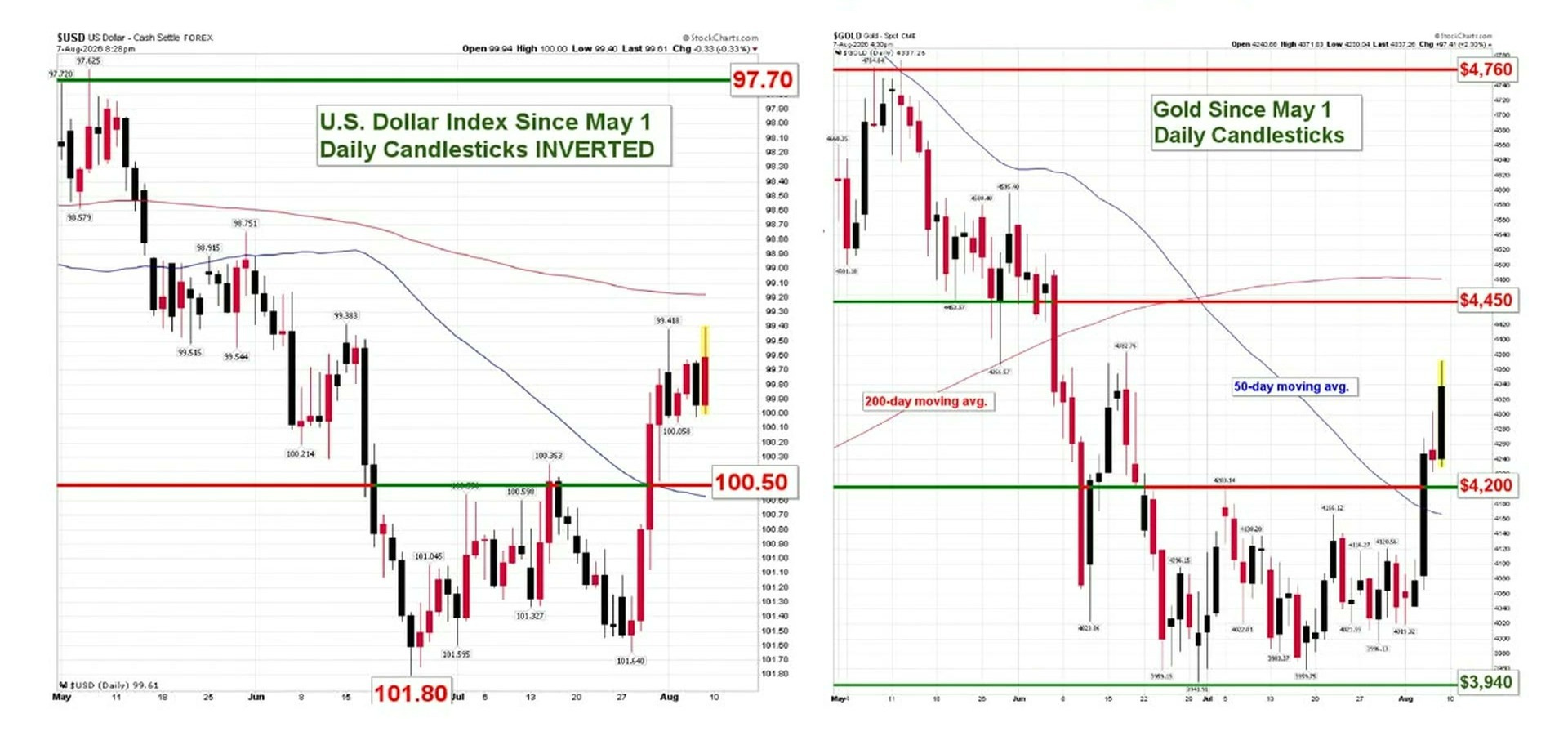
Inverted US Dollar Index and Gold spot price daily candlestick charts comparison 2026
These two charts compare the U.S. Dollar Index (left, shown inverted so down means the dollar is rising) with the price of gold (right) from May through early August 2026. When the dollar weakens, gold typically rises…inverting the dollar chart makes that mirror relationship easy to see. The dollar has fallen sharply from around 97.72 toward the 101.80 level (remember: the chart is flipped, so lower on the left means a stronger dollar reading is being reversed). Gold has climbed from roughly $3,940 toward resistance near $4,450–$4,760, key price ceilings where sellers have previously stepped in. The most striking observation: gold has recently bounced hard off the $4,200 support level and is pushing back toward $4,450, closely tracking the dollar's renewed weakness…a classic inverse relationship playing out in real time.
[Section Divider Image]

Where Gold’s Support and Resistance Levels Sit Now

Let me take you through the futures contract, because that is where the levels are cleanest.

Go all the way back to November, to that major support and resistance line at about $4,410 in the gold futures contract. Back in November and December it had a little trouble getting over that. Then it did, and we rallied all the way to $5,400, which is where the price correction started in earnest. On the way back down, gold came to that same $4,410 line and bounced off it, went back over, came down to it a second time, and went back higher again. Then gold finally broke below it over the last three months, selling into a lower trading range. And now we are back up again, probing right up against it in the futures market for the first time in about three months.

That is the bigger picture support and resistance line for gold in the futures contract.
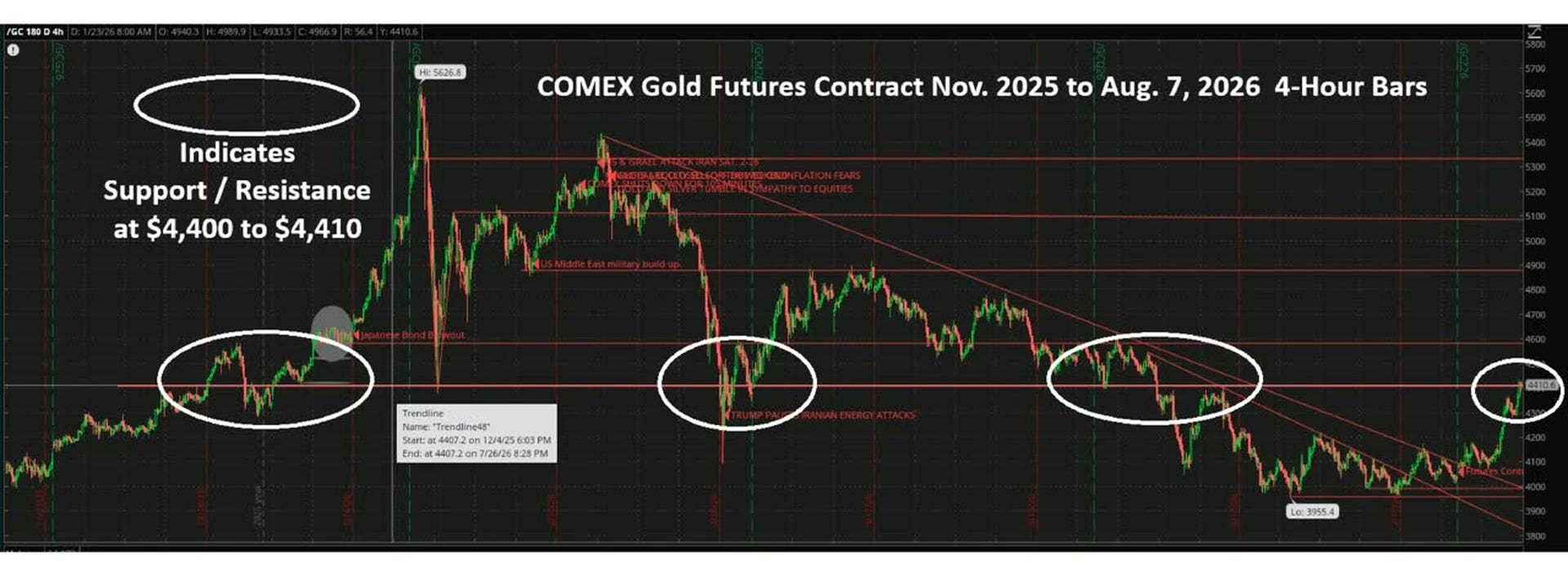
COMEX gold futures 4-hour chart showing support resistance levels at $4,400 to $4,410
This candlestick chart tracks COMEX gold futures prices (each bar shows 4 hours of trading) from late 2025 through early August 2026. Gold surged to a peak near $5,627 before selling off sharply, eventually dropping to a low around $3,955. The circled areas highlight a key price level between $4,400 and $4,410, which has repeatedly acted as both a floor (support) and a ceiling (resistance)…meaning prices bounce off this zone multiple times. This repeated bouncing makes $4,400–$4,410 a critical watch level: a decisive break above or below it could signal the next major price move. As of August 7, 2026, gold sits right at that $4,410 zone, making the current moment a potential turning point for investors.

Off to the right of that chart there are two descending upside resistance lines. One goes all the way back to March 1st and runs off to the far right of the chart. The other is shorter term, drawn since June 3rd. Both are material in this rally on the way back up.

At first we moved over the lower, shorter-term upside resistance level, ran right up to the longer-term one, and failed there. The market settled back down. Then it came back and broke over that longer-term line before this rally got moving in earnest.
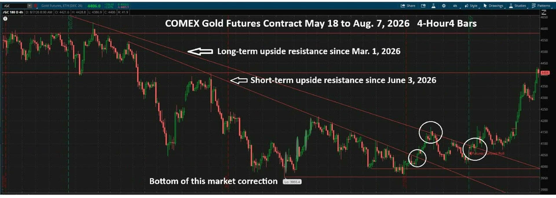
COMEX gold futures 4-hour chart showing resistance levels and market correction bottom 2026
This candlestick chart tracks COMEX gold futures prices (each candle shows 4 hours of price action) from mid-May to early August 2026. Gold fell steadily from above $4,500 into a correction low near $3,955, then staged a sharp recovery back above $4,400. Two downward-sloping resistance lines (price ceilings where sellers repeatedly stepped in) contained the decline…one dating back to March 2026, one to June 2026. The circled areas near the bottom mark where buyers successfully defended support, signaling the correction was ending. The most striking development: gold has broken decisively above both resistance lines, suggesting the months-long correction is over and bullish momentum has resumed.

Drill down a little tighter and you can see that once we broke over those two descending lines, the next upside resistance was $4,175. That level capped the market for three trading sessions, before gold finally broke over it.
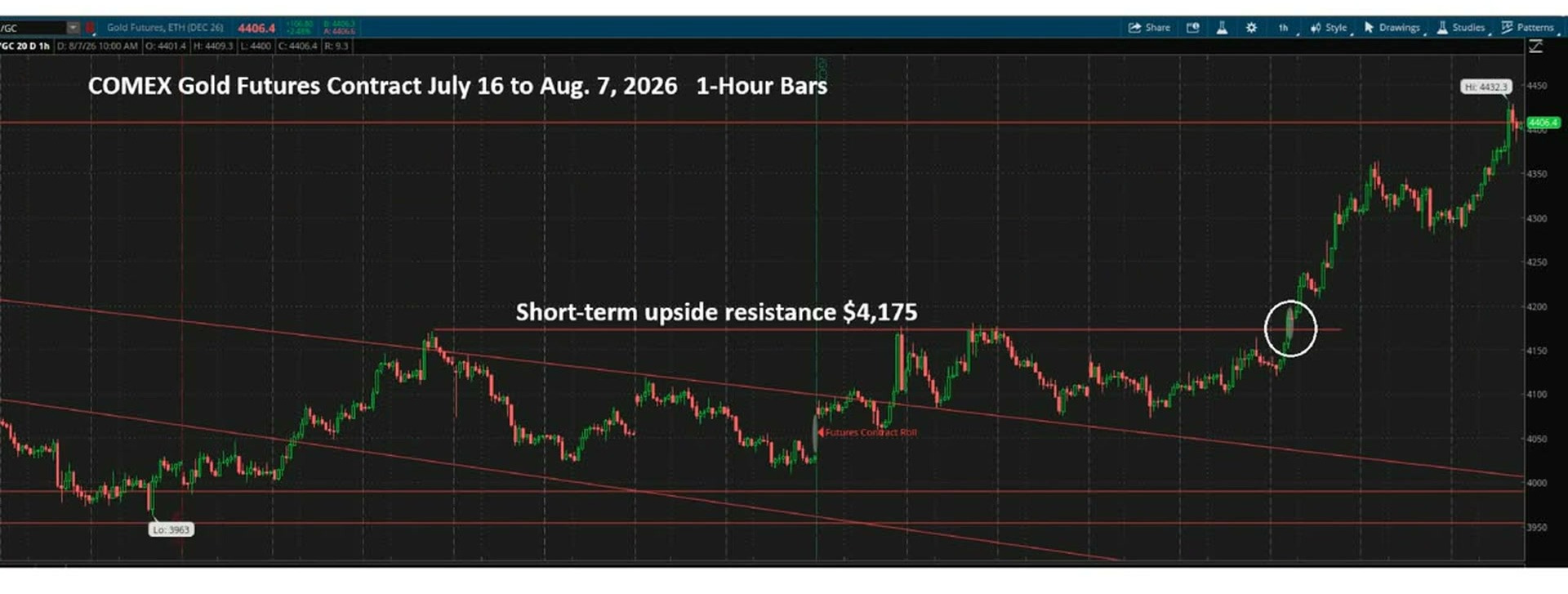
COMEX gold futures 1-hour chart showing upside resistance at 4175 July August 2026
This chart tracks the price of gold futures (contracts to buy gold at a set price on a future date) on the COMEX exchange, shown hour by hour from mid-July to early August 2026. It matters to investors because gold is a key safe-haven asset — its price signals how worried markets are about inflation, currency weakness, or economic instability. Gold hit a low of roughly $3,963 in mid-July, then climbed steadily, breaking through a noted resistance level (a price ceiling where selling pressure tends to stall rallies) of $4,175. After breaking that barrier, the price surged sharply, reaching a new high of $4,432 by early August…a gain of nearly 12% in just three weeks. The speed and size of the breakout above $4,175 is the standout feature, suggesting strong buying momentum with little overhead resistance to slow the rally.

Now here is what actually happened this week, hour by hour.

Gold broke over $4,175 in the futures contract Wednesday while we slept, in the Asian markets. We saw follow-through buying in London, and then follow-through buying again in New York, where gold closed out at about $4,300. There was further buying in Asia overnight while we slept. We settled back on Thursday and held support at $4,280. The market started trending higher again overnight and into Friday morning, and then we got that weak jobs report, which pushed gold up over that major upside resistance level going all the way back to November, at least for a few hours. Gold hit a peak of $4,432 in the futures market before settling back and closing out the futures market right at $4,400.
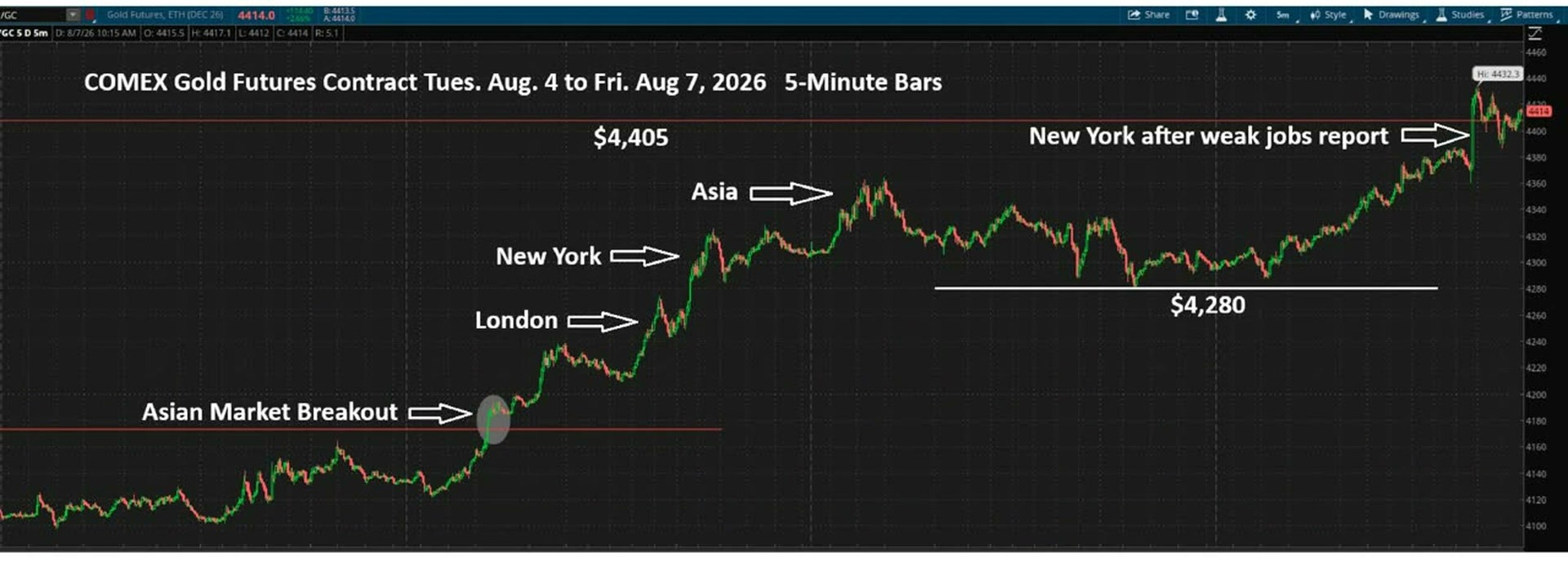
COMEX gold futures 5-minute chart showing breakout rally from $4,180 to $4,432 August 2026
This chart tracks the price of gold futures (contracts to buy gold at a set price on a future date) on the COMEX exchange, shown in 5-minute intervals from Tuesday August 4 to Friday August 7, 2026. Gold prices matter to investors because gold is a traditional safe-haven asset…people buy it when they fear economic trouble or a weakening dollar. The most striking observation is the sharp, sustained rally from around $4,100 to over $4,430…a gain of more than $300…in just four trading days. The breakout began during Asian market hours, then accelerated through London and New York sessions, suggesting broad global buying interest. The final surge on Friday was triggered by a weak U.S. jobs report, which investors interpreted as a sign the Federal Reserve may cut interest rates, making gold more attractive.

Gold is looking very good right now, with the futures contract working between $4,280 and $4,400. That puts spot market support at about $4,240 to $4,360. We closed the spot market Friday at $4,345.

On the one-year chart I have upside resistance at $4,370, and we did not quite break it in the spot market Friday. But you can see that nice rounding bottom I have been pointing out over the last three or four updates. The point where I marked the dollar falling on that chart is where the yen intervention hit. The dollar tumbled from there, and gold has now responded, creating a full U-shaped bottom in the gold market that I have been describing for the last couple of weeks.

So it seemed like this was possible and it was coming. Now we have got the catalyst that has triggered it, and we have got a rally again. Headwinds are starting to become tailwinds.
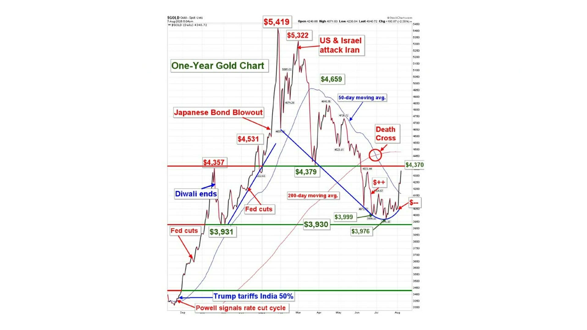
One-year gold price chart showing key events from $3,931 to $5,419
This is a one-year daily price chart of gold, showing how the price per ounce has moved from around $3,400 in late 2024 to today's level near $4,340. Each price swing is labeled with the news event that triggered it…Fed rate cuts, Diwali seasonal demand, a Japanese bond market crisis, and a US-Israel strike on Iran all pushed gold sharply higher. The chart also shows two widely-watched trend lines: the 50-day moving average (the average price over the last 50 days) and the 200-day moving average…when the 50-day crosses below the 200-day, traders call it a 'Death Cross,' a bearish warning signal now visible on the right side. Gold peaked near $5,419 before dropping roughly 20%, and is now attempting to recover toward the $4,370 resistance level…a price ceiling where sellers have previously stepped in. For investors, the key tension is whether gold can break back above $4,370 or whether the Death Cross signals further weakness ahead.
[Section Divider Image]

Silver Clears Its 50-Day Moving Average on a W Formation

We have something similar in the silver chart.

In the futures contract we had descending upside resistance since June 2. We broke over that, and then went into a sideways trading range between about $57 and $60.45, after holding support at $55.00 and $56.10. Those two lows are the floor I have been working from.
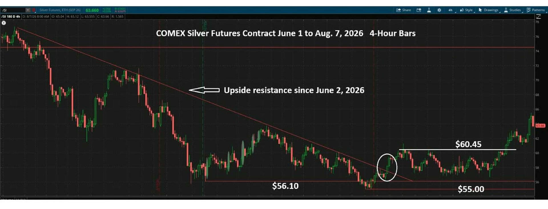
COMEX silver futures 4-hour candlestick chart showing downtrend resistance and key support levels
This candlestick chart tracks the price of COMEX Silver Futures from June 1 to August 7, 2026, using 4-hour price bars…each bar shows the open, close, high, and low price within that 4-hour window. Silver prices matter to investors as a store of value and industrial metal; futures contracts let traders lock in prices for future delivery. The most notable feature is a descending resistance line (a ceiling where sellers repeatedly push prices back down) that has capped silver since June 2, 2026. Despite that ceiling, silver recently bounced hard off the $55.00 support floor (a price level where buyers consistently step in) and has surged past $60.45. The current price near $63.66 suggests silver may finally be breaking above that long-standing resistance…a potentially significant bullish signal.

Then we broke over the top of that range. More recently silver had been sideways between about $57 and $61 in the futures market, under a second and shorter downward resistance line running back to the third week of July. This week silver gave us the same pattern gold did. Asian market trading took it over that line, then Asian trading pushed it higher twice more, leading into Friday’s New York session, where the futures market peaked at $65.48 before closing at $63.80, with the spot market at about $63.60.
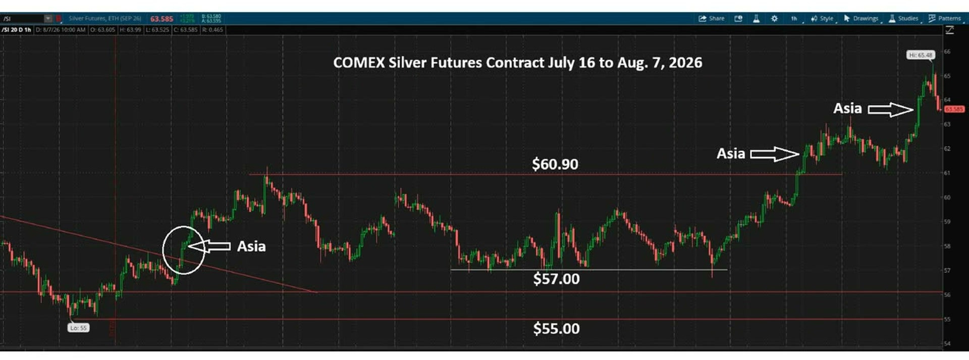
COMEX silver futures contract chart July to August 2026 showing price rally from $55 to $65.48
This candlestick chart (where each bar shows an hour of price movement) tracks COMEX silver futures from mid-July to early August 2026. Silver fell to a low of $55, then staged a strong rally, breaking above key resistance levels at $57 and $60.90. The chart highlights 'Asia session' breakouts…moments during Asian trading hours when price surged decisively higher. This pattern of repeated Asia-session-driven rallies suggests consistent buying pressure from Eastern markets. The most striking observation: silver climbed nearly 20% from its $55 low to a high of $65.48 in just three weeks, a very fast move for a major commodity.

On the one-year silver chart, the blue descending trend line I keep on it has come down to about $60. We have moved over it, so it is support now rather than resistance, and we are back into the trading range that has been descending. But more importantly, we are over the 50-day moving average by just a little bit.

If silver can hold above that 50-day moving average, it is a positive sign. And by the way, gold is sharply over its own 50-day moving average.

We do not quite have the same U-shaped bottom in the silver market. But silver has made a nice W formation instead. So the silver market is looking pretty good as well.
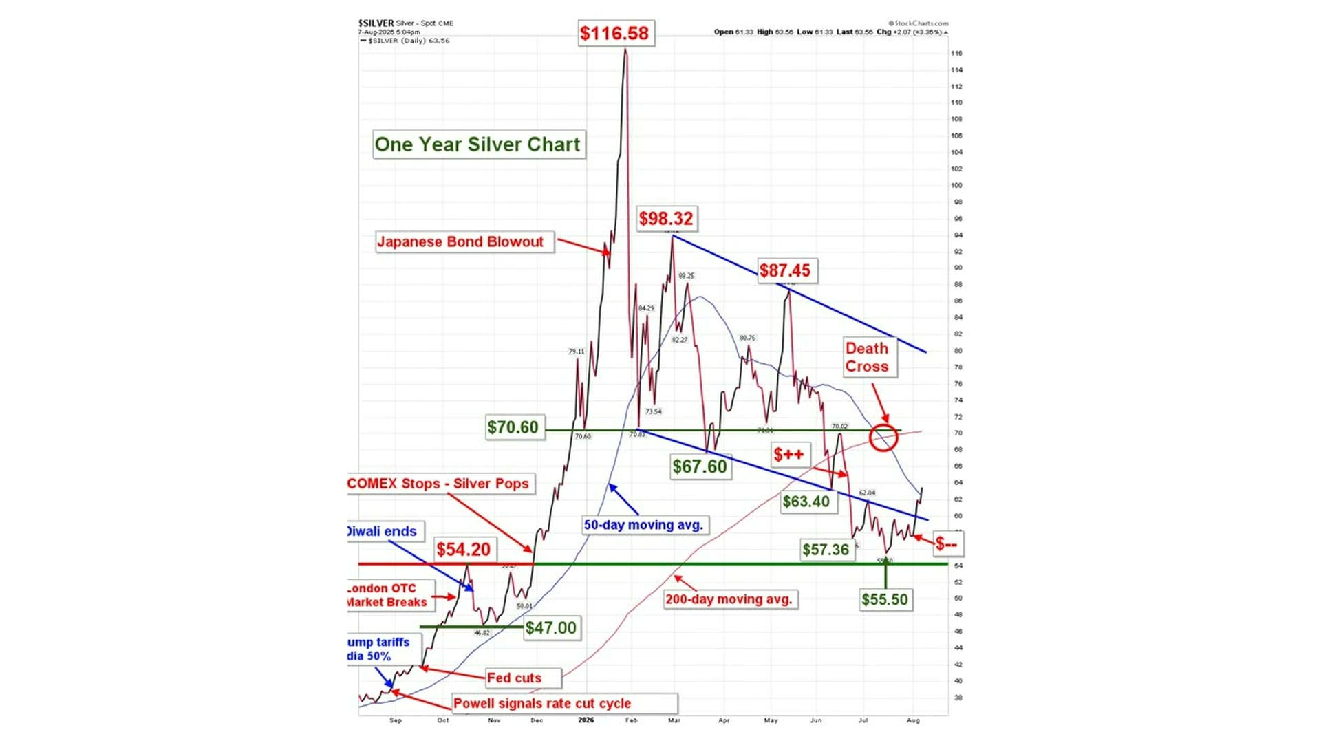
One year silver price chart showing peak at $116.58 with death cross signal
This is a one-year daily price chart for silver (measured in dollars per ounce), running from September 2025 through early August 2026. Silver spiked to an extraordinary peak of $116.58 around January 2026, driven by events like a Japanese bond market crisis and stops being triggered on the COMEX (the main U.S. commodities exchange), then crashed sharply. Since that peak, silver has lost roughly half its value, falling to around $63.56 by early August 2026. A 'Death Cross' has recently formed…this is when the short-term 50-day moving average (the blue line) crosses below the longer-term 200-day moving average (the red line), a signal traders read as a bearish warning of further price declines. The chart shows strong support (a price floor where buyers have historically stepped in) around $54–$55, which is now being tested again after the steep selloff.
[Section Divider Image]

Platinum and Palladium Levels After the Tuesday Breakout

Now back to the two metals that led.

Platinum broke out in the futures contract over $1,680 during Tuesday’s trading and has held a higher trading range over the last three trading sessions, between $1,725 on the low and $1,800 on the high. We closed out the spot market Friday at $1,750, pretty much right in the middle of the range.
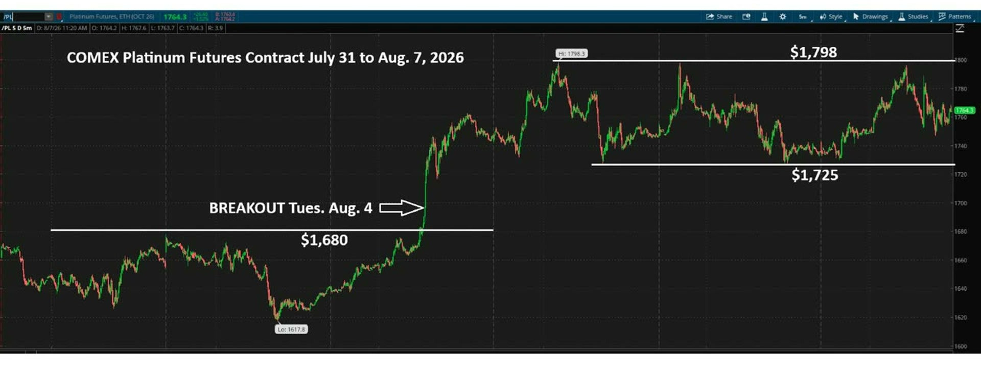
COMEX platinum futures chart showing breakout above 1680 resistance level August 2026
This 5-minute candlestick chart tracks the price of platinum futures (contracts to buy platinum at a set price on a future date) on the COMEX exchange from July 31 to August 7, 2026. It matters to investors because platinum is a precious industrial metal, and futures prices signal where traders expect its value to head. The standout event is a sharp breakout on Tuesday, August 4, when the price burst above a ceiling that had held firm at $1,680 for days. After the breakout, platinum surged rapidly to a high of $1,798 before settling into a trading range between $1,725 and $1,798. The current price of $1,764 sits comfortably above the old $1,680 barrier, suggesting the breakout has held and buyers remain in control.

Palladium looks very similar. It broke out on Tuesday over $1,310 and is trading now in a $1,360 to $1,410 range, closing out the spot market Friday at about $1,385.
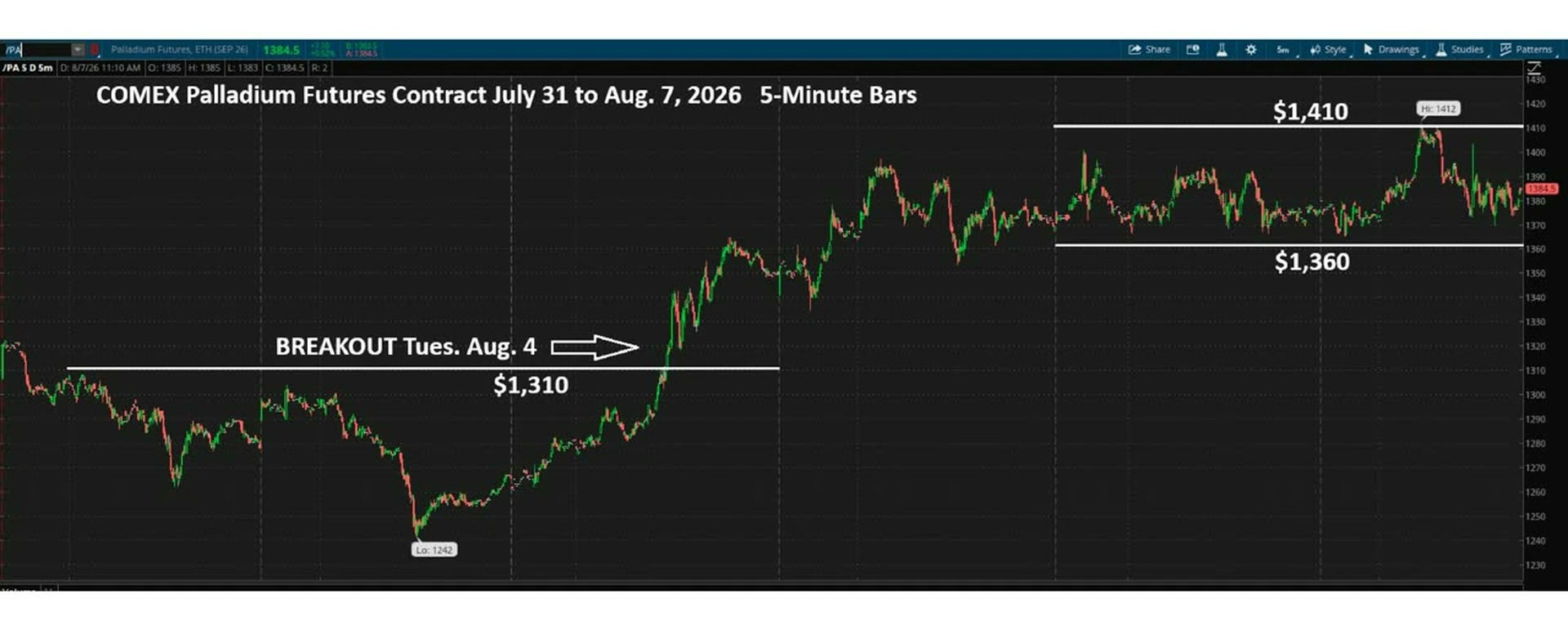
COMEX Palladium Futures 5-minute chart showing breakout above 1310 toward 1410 resistance
This chart tracks the price of palladium futures (contracts to buy palladium at a set price on a future date) minute-by-minute from July 31 to August 7, 2026. Palladium is a precious metal used heavily in catalytic converters, so its price reflects industrial demand and supply pressures. The price dropped sharply to a low of $1,242 before staging a strong recovery and breaking above the key resistance level of $1,310 on Tuesday, August 4…a 'breakout' meaning buyers overpowered sellers at that price ceiling. After the breakout, palladium surged roughly $170, establishing a new trading range between $1,360 and $1,410, with a recent high of $1,412. The most notable development is the speed and strength of the post-breakout rally, which more than recovered the earlier selloff and pushed prices to multi-week highs.

On the one-year platinum chart you can see platinum has been moving sideways in a tight range. Now it has broken higher over its 50-day moving average and over that major support and resistance line I have had on the chart for months at $1,723, which is right where the low of this week’s range has been. I am going to be kind of tentative on the upside there in the short term.
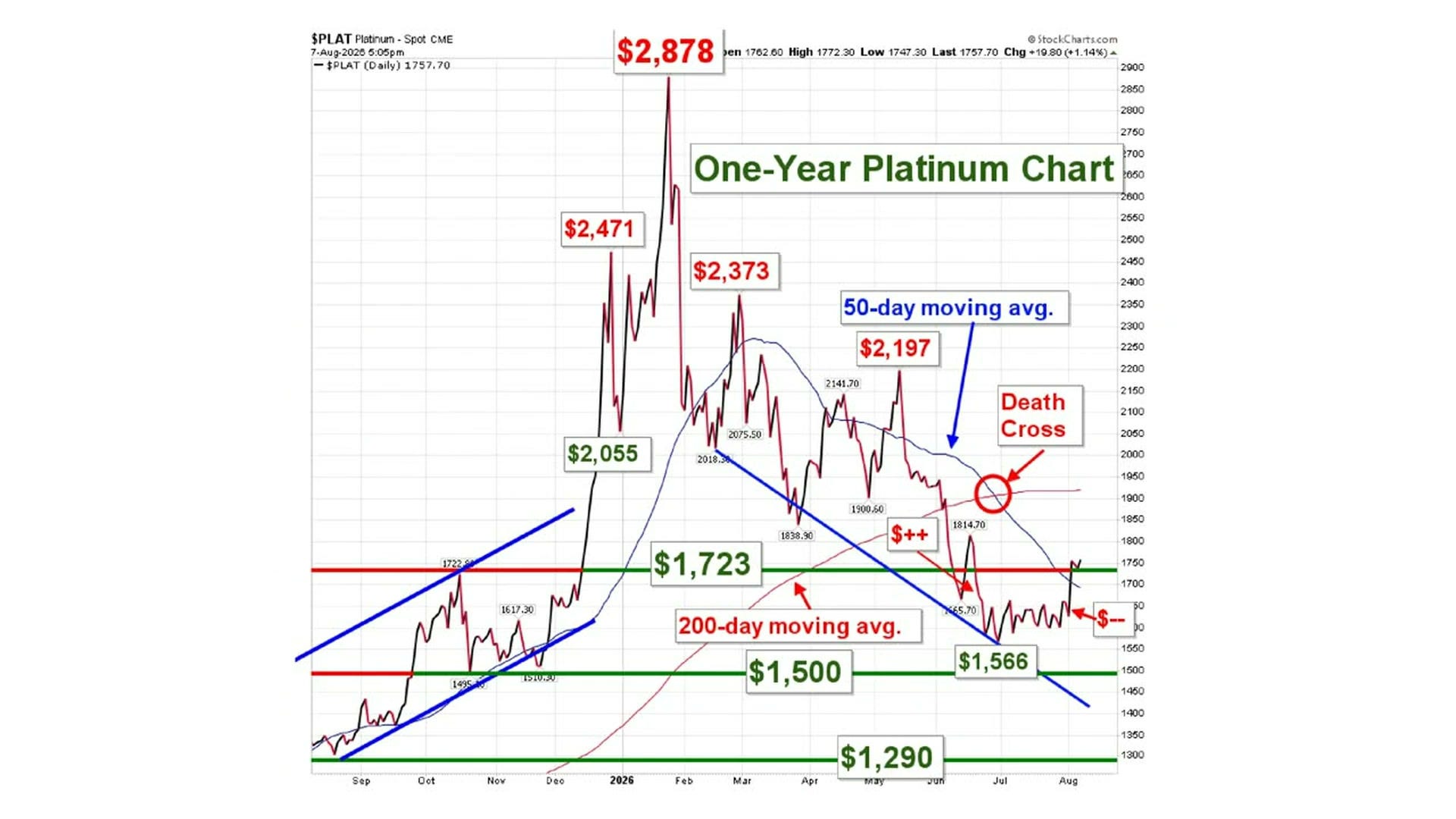
One-year platinum spot price chart showing death cross and key support levels
This chart tracks the price of platinum over the past year, with two key trend lines: the 50-day moving average (short-term trend) shown in blue, and the 200-day moving average (long-term trend) shown in red. When the short-term average crosses below the long-term average, it forms a 'Death Cross'…a widely watched signal that warns of further price declines ahead. That crossing happened recently, circled on the chart. Platinum surged to a peak of $2,878 earlier in 2026 before falling sharply, and now trades around $1,757…a drop of roughly 39% from that high. Key support levels (price floors where buyers have historically stepped in) sit at $1,723, $1,566, $1,500, and $1,290. For investors, the Death Cross combined with the steep drop from the peak suggests caution…the chart is signaling more potential weakness unless price can reclaim higher ground.

Palladium has been in a modest uptrend, and again it has already broken over its 50-day moving average. Now it is testing its longer-term support and resistance level at $1,380, from above.
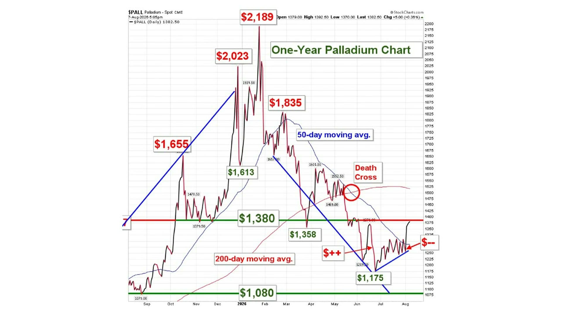
One-year palladium spot price chart showing death cross and key support levels
This is a one-year price chart for palladium, a rare metal used mainly in catalytic converters for cars. The price soared from around $1,080 to a peak of $2,189 early in 2026, then fell sharply back toward $1,380. After bottoming near $1,175 in July, the price has bounced and is now hovering right at the key $1,380 resistance level…a price ceiling the market has tested repeatedly. A 'Death Cross' formed in May, meaning the short-term average price dropped below the long-term average, which is a classic warning sign of further declines. The most notable thing right now: palladium is sitting at a critical make-or-break level…a sustained move above $1,380 would signal recovery, while a rejection there could send prices back toward $1,080.

All four of these precious metals have made pretty good gains this week. As I said at the top: gold 8%, silver 10%, platinum 6%, palladium 8%. They could give a little back and still hold these nice uptrends that are developing. I do expect we will see a little bit of profit taking, but probably not much.

I do think the trend is your friend here. From a seasonal and a cyclical basis, the timing right now is pretty good to see metals start moving higher again from here. I would expect that move to be a cautious one. But I do think the bottoms for precious metals are now in.

[Section Divider Image]

The Weak July Jobs Report Underneath the Headline

Here is one of the reasons why.

We had a really weak jobs report Friday for the month of July, with the U.S. losing 23,000 jobs. June was revised down to 20,000 jobs.

And May has been shellacked. Friday’s report revised it down another 66,000 jobs, to 63,000 net. The revision before that had already taken 70,000 off. May first came in at over 200,000, and two revisions later it stands at 63,000.

So clearly, the trend for job creation in the U.S. is sharply lower.

And what sector has lost 80,000 jobs in the last two months alone? Leisure and hospitality.

Leisure and hospitality and healthcare have been the two pillars of job creation in the U.S. for the last two or three years. Now we have seen leisure and hospitality take a big tumble. Discretionary spending is tightening up. In my opinion, that is what that means.

Some of it could have a little bit to do with the World Cup coming and going. But still, 80,000 jobs lost out of this one very important sector in two months is a big, big change in direction.
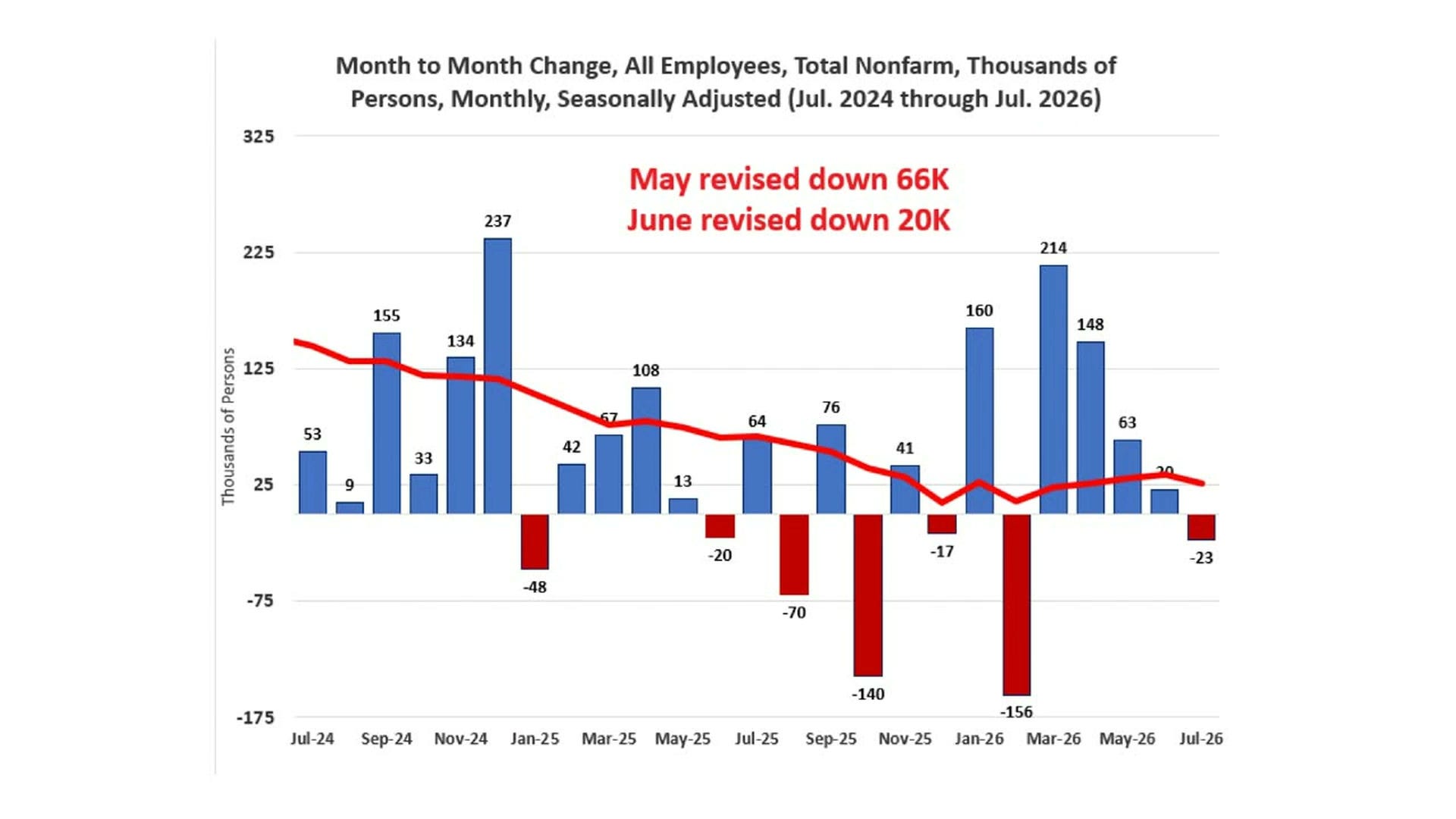
Bar chart showing monthly US nonfarm payroll changes seasonally adjusted July 2024 through July 2026
This chart shows how many jobs the U.S. economy added or lost each month from July 2024 through July 2026. The red line is a smoothed trend (moving average) that cuts through the noise to show the overall direction of job growth. This matters to investors because strong job growth signals a healthy economy, while weakness can signal trouble ahead. The most striking detail: several months show large negative bars (job losses), including a severe -156K drop in January 2026 and -140K in September 2025. Also notable, the government revised May's figure down by 66,000 jobs and June's down by 20,000…meaning the jobs market was even weaker than first reported. The trend line is clearly falling, suggesting the labor market has been losing momentum since late 2024.
[Section Divider Image]

Oil Comes Down, But the Diesel Crack Spread Stays Inflationary

Let’s take a look at oil, because this is where my longer-running concern still sits.

This is West Texas Intermediate crude next to Brent crude, and the patterns are very similar. We hit lows when the Memorandum of Understanding was signed and it looked like things were good. Then the flare-up and the military activity punched the oil price back up again. Now, as it looks like the Strait of Hormuz might actually be reopening soon, we are seeing oil come back down again.
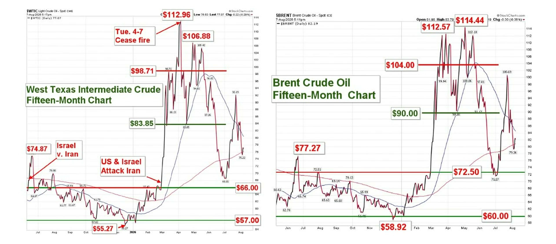
WTI and Brent crude oil fifteen-month price charts showing key support resistance levels
These are 15-month daily price charts for the two global oil benchmarks: West Texas Intermediate (WTI, used in the US) and Brent Crude (used internationally). Both charts show how oil prices reacted to major geopolitical events, specifically the Israel-Iran conflict and a subsequent ceasefire, causing dramatic price spikes and drops. Oil prices surged to roughly $113–$114 per barrel during peak conflict fears before collapsing sharply back toward the $77–$82 range by August. For investors, oil price swings affect everything from gasoline costs to airline profits to inflation…making these charts a key economic indicator. The most striking observation: prices nearly doubled in a matter of weeks due to war fears, then gave back almost all of those gains just as quickly once a ceasefire was announced.

But the bigger rub is with the distillates, the products we refine from crude oil: gasoline, diesel and jet fuel. The spread between the oil price and the distillates is called the crack spreads. Funny name, I know.

These figures are as of July 31st, a week ago. The spread between crude and gasoline is just under $50. In January it was $30.

The spread between crude and diesel is $88 against an $86 oil price. That puts the diesel price at more than double the price of the crude it is refined from. Previously, when oil was $60, diesel was $90, a $30 spread.

And what carries everything around the United States? Diesel engine trucks.

So fundamentally, this remains inflationary. Jet fuel is in there as well, at about a $70 spread. It is coming down a bit, and we are seeing gasoline come down a bit as well, because gasoline inventories are starting to rebuild a little. But diesel in particular is problematic, and it is probably going to stay that way for a while. These are EIA’s weekly spot prices for crude, gasoline, diesel and jet fuel.
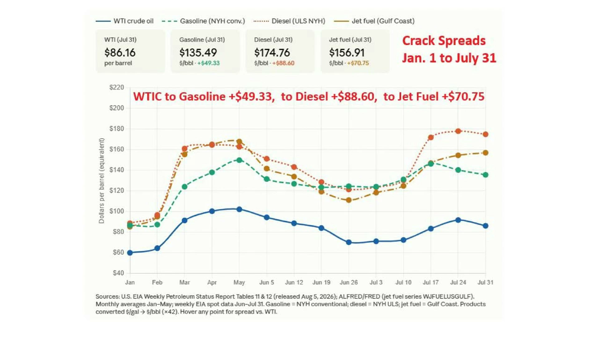
Crack spreads chart showing WTI crude oil versus gasoline diesel and jet fuel prices January to July 31 2026
This chart tracks the price of crude oil versus the refined fuels made from it — gasoline, diesel, and jet fuel…from January through July 31. The gap between crude oil's price and a refined fuel's price is called a 'crack spread'; a wider gap means refiners earn bigger profits per barrel. For investors, large crack spreads signal strong refining margins, which boosts earnings for companies like Valero, Marathon, or Phillips 66. The most striking observation: diesel's crack spread hit +$88.60 per barrel by July 31…meaning refiners are earning nearly $89 profit on every barrel of crude they turn into diesel. All three crack spreads surged dramatically in spring, dipped mid-summer, then rebounded sharply in late July, suggesting renewed demand pressure on refined products.

This could be some of the pressure that President Trump has to get that oil flowing again. We are at that point in time where we could be hitting real tank bottoms. If we go much further in time without getting the oil flowing, we could have some much bigger problems in pricing and in supplies.

That is where I need to update the thesis I have been carrying for months. My concern all along has been that higher oil creates inflationary expectations that pushes yields higher, and higher yields push gold lower. Crude itself is now easing on the prospect of the strait reopening, which takes the edge off that. But the distillate spreads are doing the inflationary work all by themselves, and they are not easing at anything like the same speed.

[Section Divider Image]

Strait of Hormuz Negotiations and Whether We Go Big or Go Home

One last thing before I wrap up.

There has not been a lot of discussion the last couple of days about what is going on with the negotiations between Oman and Iran over reopening the Strait of Hormuz. Iran said earlier this month that those talks were in their final stages. President Trump has been remarkably quiet.

Do we truly have a munitions problem, so that we cannot go big like he has threatened to do on several occasions?

An old friend of mine, a wonderful lady I have known for years, had a great expression: go big or go home. And it looks to me like we might be going home, simply to get the oil flowing again. It is very possible.

I truly hope this conflict can come to a resolution and we can get back to business as usual. We may be on the cusp of that now, by going home. Time will tell.
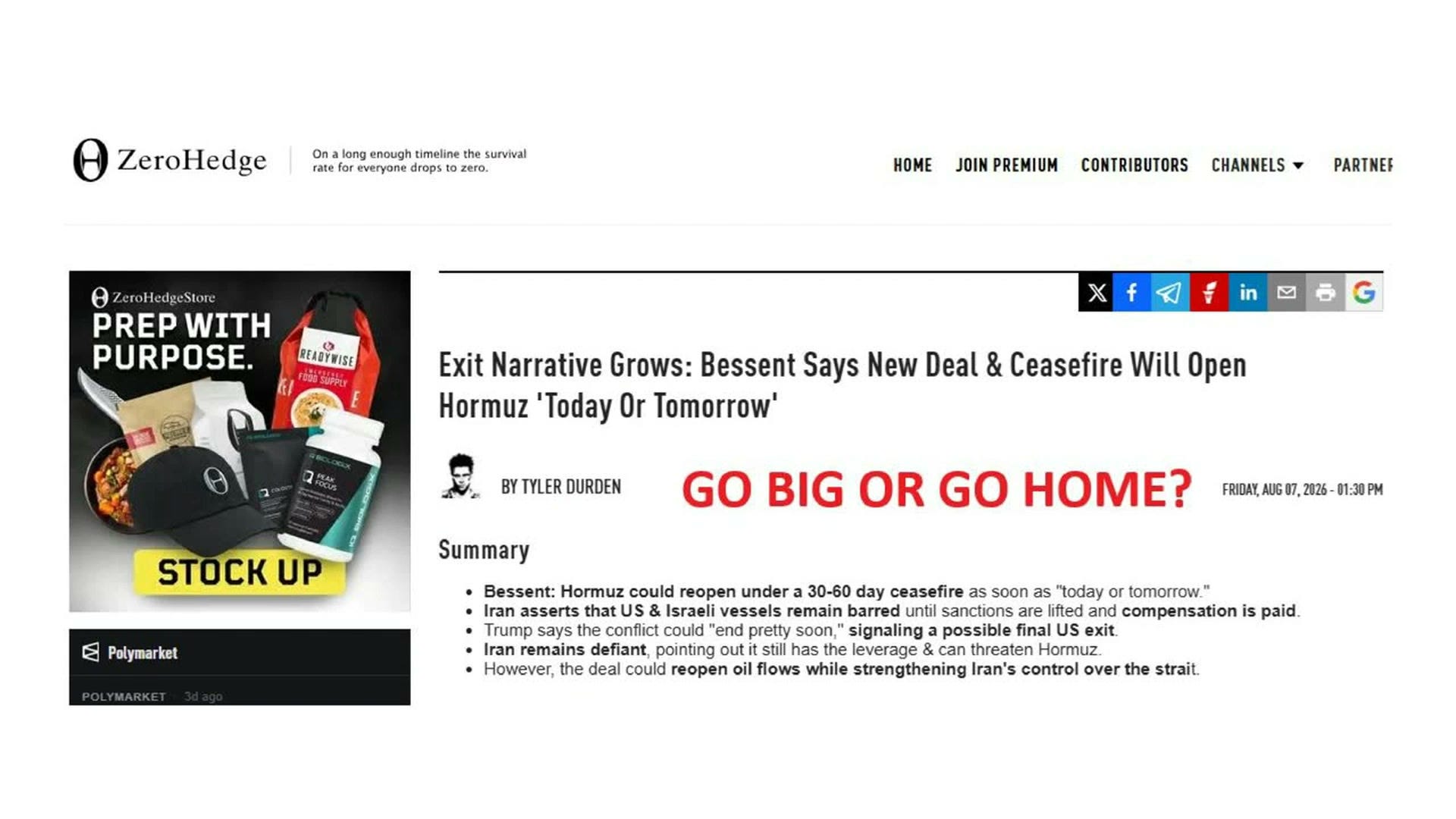
ZeroHedge article headline Bessent says ceasefire will open Strait of Hormuz
This ZeroHedge article summary covers negotiations around reopening the Strait of Hormuz, a critical chokepoint for global oil shipments. US Treasury Secretary Bessent says a ceasefire deal could reopen the strait within 1-2 days under a 30-60 day truce. Iran is holding firm, demanding sanctions relief and financial compensation before allowing US and Israeli vessels through. For investors, a reopening would ease oil supply fears, while a breakdown could keep energy prices elevated. The key risk: any deal may leave Iran with stronger long-term control over this strategically vital waterway.
[Section Divider Image]

The Levels I Am Carrying Into Next Week

These are the same ones I walked you through above, gathered in one place.

The dollar is the swing factor, and the intervention is the thing to keep an eye on, because as I said, most of the time these do not hold. 100.50 on the index is the line that has mattered.

On gold, $4,370 in the spot market is the line gold could not quite get over on Friday. On silver, it is that 50-day moving average at $62, which we are only just above. Platinum has cleared $1,723. Palladium is testing $1,380. Holding those is what turns a good week into an uptrend.

Those are the levels I will be watching, and they are the ones I would want you watching too.

[Section Divider Image]

If You Are Looking at Physical Precious Metals

If you are interested in physical precious metals, we have a getting started guide you can access on our website. It lists the most widely traded, most competitively priced, and most importantly for you as a consumer, the most easily sellable precious metals products there are in the marketplace.

We have live, online, transparent and extremely competitive pricing on those mainstream bullion products and on vintage U.S. gold coins.

American Gold Exchange Getting Started with Precious Metals guide and QR code

Thank you for your time today, and thank you to our loyal clients who have given us your trust and support for the last 28 years. Without you we would not have a business, and we are grateful for you each and every day.

Best wishes for the rest of the summer holiday. The school year will be starting up and the regular business cycle will be starting up again before you know it. So stay cool out there, and let’s see how this precious metals rally develops over the next couple of weeks.

Looks pretty promising to me.

So thanks again for your time, and good luck out there.

[Section Divider Image]

Discussion about this video

User's avatar

Ready for more?